A friend of mine and designer at Dropbox, Colin Dunn, reached out to me in January. He asked if I would mind him referring me to one of their project managers, Preston Hershorn, for an upcoming gig. Of course, I didn’t mind.
We spoke a few times on the phone, discussing a mystery project that needed a marketing website. I was fresh off of building the Pencil website for FiftyThree, and interested in building more of these single-page websites with a touch of something special. These websites allowed me to return to my roots of experimenting with code while also serving an actual purpose.
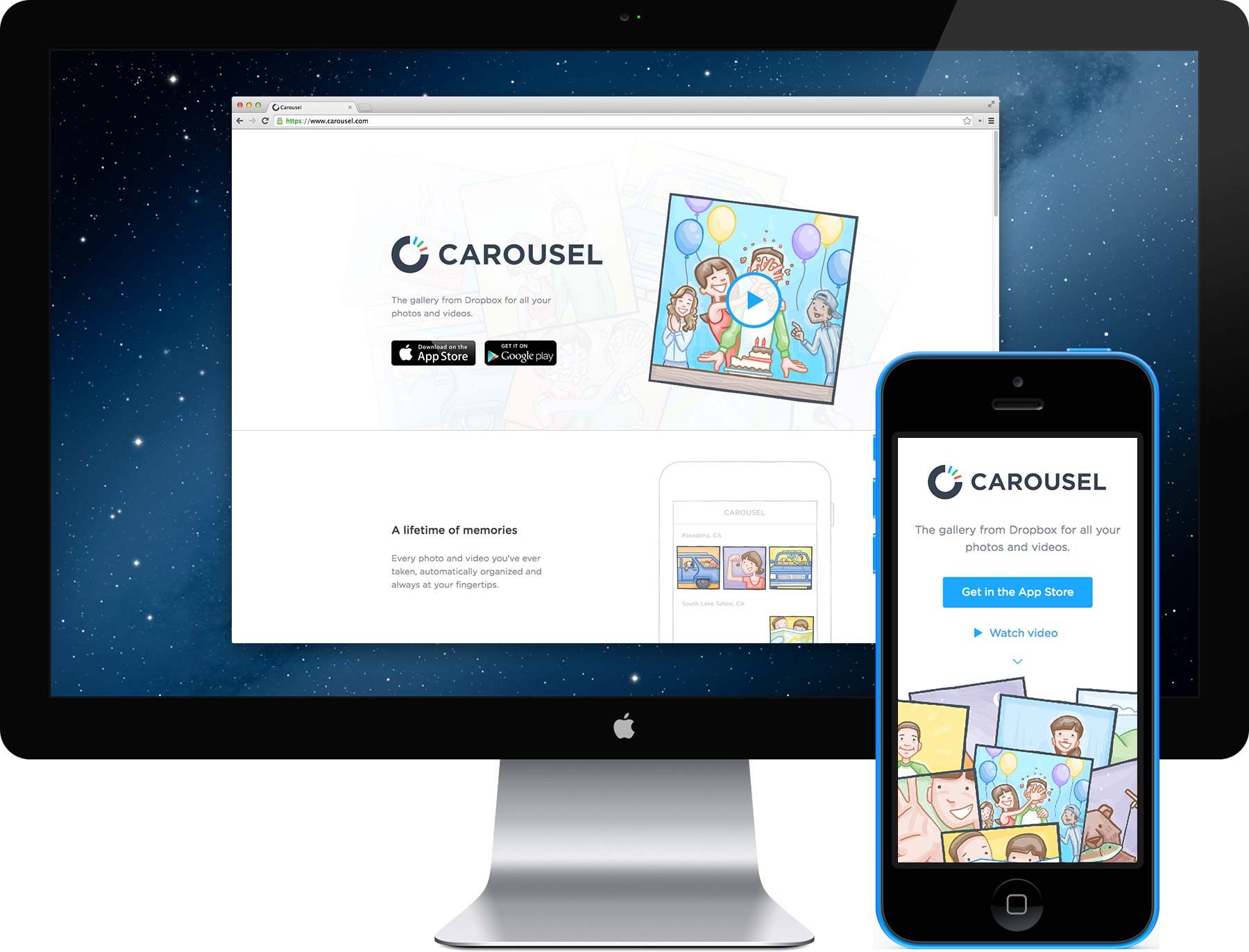
I flew out to San Francisco to work in-house at Dropbox for a week. On the first day, I sat in on a team meeting to review the state of this mystery project, named “Carousel”. A few team members provided an overview of the branding, along with its history. They demo’d the app itself, their original idea for the website, and storyboards for the upcoming video. It was impressive to see such a large-scale project represented by such a determined team. There was no question they all believed in Carousel.
While at Dropbox HQ, I worked on the mobile website, which would step the viewer through several views. A stack of photos would fall, arranging each photo on the device, to fill in the app’s content. Several transitions would play out, demonstrating the app’s main draw—sharing photos. The photos would then return to a stack and prompt the viewer to download the app.
Since these steps felt very clear-cut, I decided to treat each one as a “slide”. Instead of using a traditional scroll, and adding yet another moving part to the already active page, I locked it in place. I then listened for touch events and advanced to the next step with any vertical movement longer than a thumb’s radius.
The designer, Alice Lee, provided me with flats and we discussed possible transitions. I first used Chrome’s device emulator to test the website, but then moved to using an actual device. This helped in discovering a few key areas of improvement where we could tie the transitions closer to the gestures of the viewer. Since we were swiping up to advance, I wanted the content to feel like it was being pushed with the viewer’s thumb or finger—the logo would scale down in the direction of the swipe and the stack of photos would be pulled up from the bottom.
Originally, the stack of photos on the last slide returned to the bottom of the stage, but this felt unnatural, as if the photos were swimming against the current of the swipe. I reversed the positioning of the stack, placing them at the top of the stage, with the content below. Again, following the direction of the swipe, this adjustment really pulled the ending together. The last slide now appears to be the continuation of first slide.
I wrapped up the mobile website that week, with exception for a few content tweaks throughout the rest of the project. After returning home to Brooklyn, I started on the desktop version. Dropbox wanted a completely different experience from mobile, but they also made it clear they didn’t want a separate “m.carousel.com” subdomain. Considering the mobile version used CSS for all of the transitions, I knew I would need to start from scratch with the desktop’s stylesheet. I ended up using the same HTML as the mobile version, but swapping out the stylesheets based on media queries on the stylesheet tags.
The original design of the desktop website used scroll-based breakpoints to trigger each transition. The text would follow one-to-one with the scroll and the device would remain fixed. This worked, but with the constant movement of the text, the viewer would be forced to switch focus between the two sides of the page. I switched the text to a fixed position and animated it in parallel with the device. This felt better, but there was a lot of waiting between transitions—and the wait would grow longer with the height of the window.
With only a couple weeks left, we decided to scrap the triggered animations and start over. Instead of relying on harsh breakpoints, we would track the animation with the scroll. To soften the feel, I took a page out of my Flash days and added friction to the scroll. This allowed the animations to ease into place without feeling so jarring. A few people at Dropbox looked at the website and felt the animations needed to snap into place better. At that time, they were a bit loose—you could easily scrub through the entire animation with a couple swipes on the trackpad.
I definitely didn’t want to return to the triggered approach from before, so I improvised. Since I was already using friction for a softer feel, I could simply increase the friction based on the scroll’s proximity to each lockpoint. In the code, I call these “speed bumps” and that’s exactly what they are. And, to make these speed bumps less apparent, I ease the friction based on the actual distance. This was enough to achieve the slick movement of the transitions while snapping each slide into place.
In the final week, there were several more revisions to the content. Initially, the desktop version had twice as many transitions, with each one split into separate parts. The second slide would swipe the screen up to portray a greater collection of photos. The third slide would transition into the conversation view with a fourth slide for easing the second message in from the bottom. We simplified these transitions by combining them, one by one, until we were left with three essential slides.
At launch, I let out a great sigh of relief. This project took a lot out of me because it consisted of countless technical challenges and several changes in direction late in the game. I’m happy with the end result, though. If we settled at any point instead of pushing through the difficult decisions, I think we would have been left with regret. Looking back, I’m incredibly grateful and fortunate that such a small gesture on Colin’s part, of putting my name in the hat, led to this collaboration.